While exchanging ideas on proportions with Fábio, older researches came to my mind and I went to dig them up from my hard drive, full of dust, in the attic of my mind.

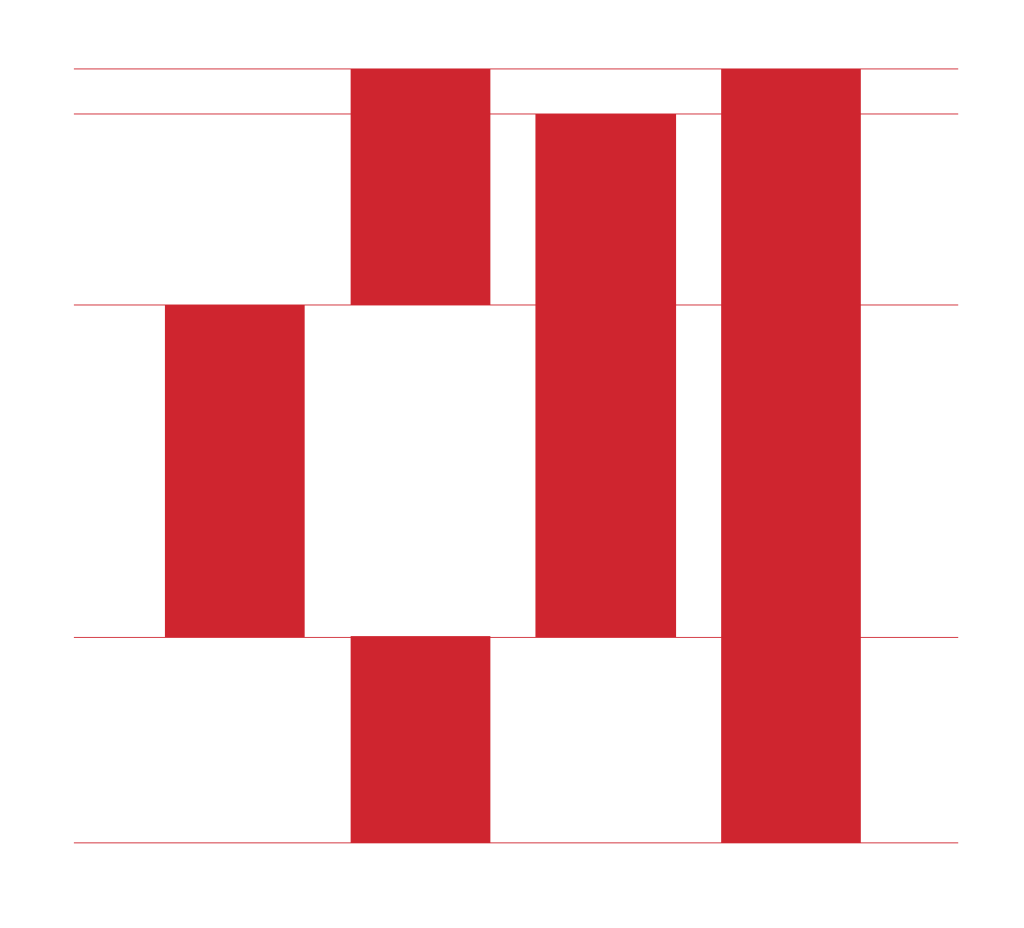
Measuring vertical metrics, prints from Villeneuve’s Breviário Grosso (approximately 9 pts).
Among other insane researches— that I’ll share further on —, I found measurements of Breviário Grosso and Petit Cannon — approximately 9 pts and 26 pts* — that reveal some interesting ideias that may help to reason further down the road.
Increasing the measurement scheme from the old researches, a diference between ascender and descender became evident, revealing a longer ascender in comparison with the descender.

Vertical metrics of Vileneuve’s Breviário Grosso (aproximately 9 pts body size)
In the 9 points body size, Villeneuve opted to use longer ascenders, when comparing with the descenders. Although I’m still unable to verify what was behind this concept in the original design, it seemed interesting to bring it to our redesign, in order to increase the x-height.
A possible reason may lie behind the frequency of ascenders and descenders in Portuguese language. The use of characters with ascenders is much more common than the ones with descenders. Among the descender we have gjpqy, while y is rarely used and j is quite uncommon, which gives us three characters with descenders with a frequent use. There are seven characters with ascenders, bdfhklt, generally much more common in the Portuguese language, with the exception of k (as of increased rarity of use). But this idea is just a supposition and if you have any input on this please let us know.

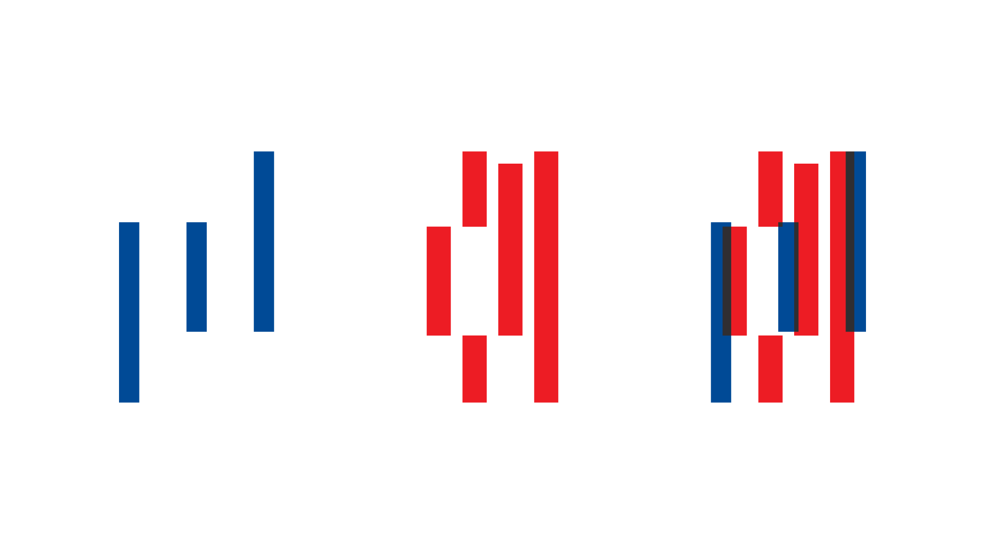
Fábio’s proportion test (blue) and Villeneuve’s Breviário Grosso‘s measurements (red) overlaped.
Moving further, comparing Villeneuve’s Breviário Grosso body size with our early study, I realised it is approximate to 425-1000 UPM size tests previously made. Since today’s print resolution is much higher, this allows us to slightly increase the x-weight, making the type more readable at small body sizes.
_________
- You can find some some more about the type body size, before the Didot point, in an article I wrote with Francisca Monteiro in the IV Encontro de Tipografia — Book of proceedings, Page 142 (Portuguese only).